


HIIT Club was a project primarily based on logo design. As a more high-end, member exclusive gym club specialising in high intensity interval training and one-on-one personal trainer to client support, the logo called for a design that would reflect those characteristics.


The main inspiration behind the logo was the idea of two ripples in water overlapping to meet in the middle, symbolising the duality of the personal trainer and the client. The main image is also an hourglass shape, reflecting the time dependent aspect of HIIT training, with each larger 'ripple' indicating the increasing intensity of the exercise.
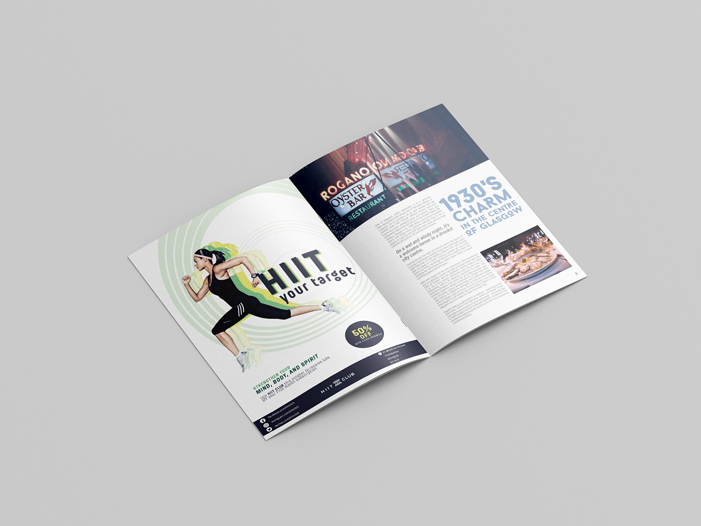

As well as a logo, the brief also asked for a poster to advertise HIIT Club. The poster would be featured in a magazine spread, and in addition to this a moving graphic version was created to be used in bus stop advertising.


